Running A/B tests on our hosting infrastructure
Split testing is a cornerstone of how we improve our products. While we usually run such tests for user-visible interface changes, this is an example of running a (successful!) multivariate test between CDNs.
The outcome is a 7% improvement in asset load times globally, translating into a +1% conversion on our site.
TL,DR:
- Fastly is generally more performant than AWS Cloudfront — for our userbase.
- A/B testing CDNs is easy (with our toolset).
- Synthetic performance checks (e.g. with Pingdom) do not reflect end user performance experience.
We split tested Cloudfront vs. Fastly across 1,000,000 users, in 12 countries, on 3 continents, over a significant time period. Using Fastly improved asset load times by up to 50% in some areas, and site conversion went up by 7.2% in the best case… and down by 6.6% in the worst (with p < 0.05).
Read on for how we set this up and analysed the results.
Current infrastructure
We currently use a CDN1 for delivery of assets (Javascript, CSS, and images) to clients (web and native apps). This is a wildly common practice when many users access the same content — in our case, for instance, restaurant photos: the content gets cached at a server that’s closer to the end user, latency-wise.
Because our hosting started with AWS, we originally used CloudFront — relatively easy to set up, does the job…
…until we started expanding the business in regions where CloudFront’s coverage seems a little more spotty, e.g. Australia, Singapore, or Hong Kong.
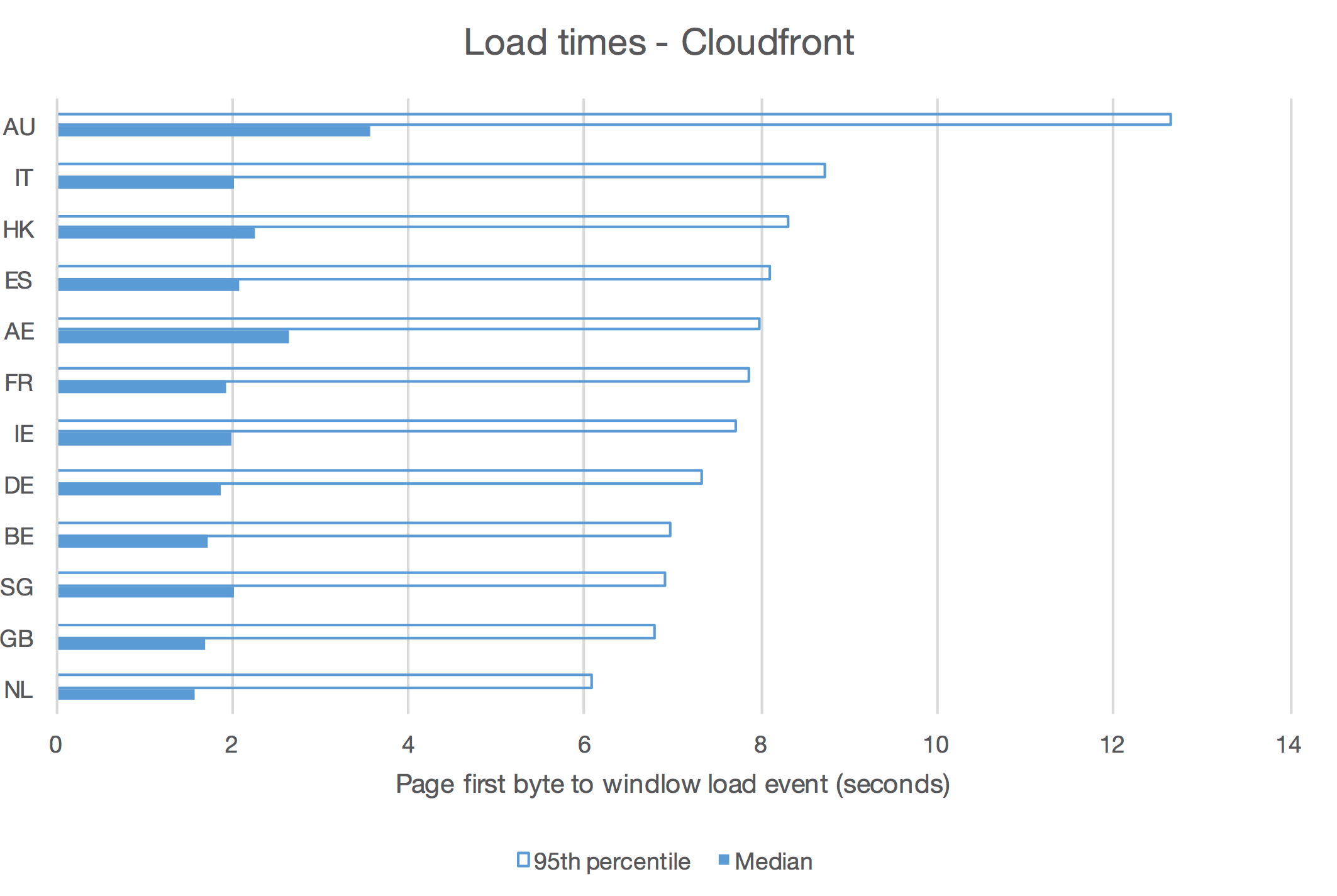
We’ll come back to the details of this chart a bit later, but it should pretty clearly show that for Cloudfront (or any CDN, really), actual performance from actual users varies quite a bit by geographical market - sometimes dramatically so, as with Australia.
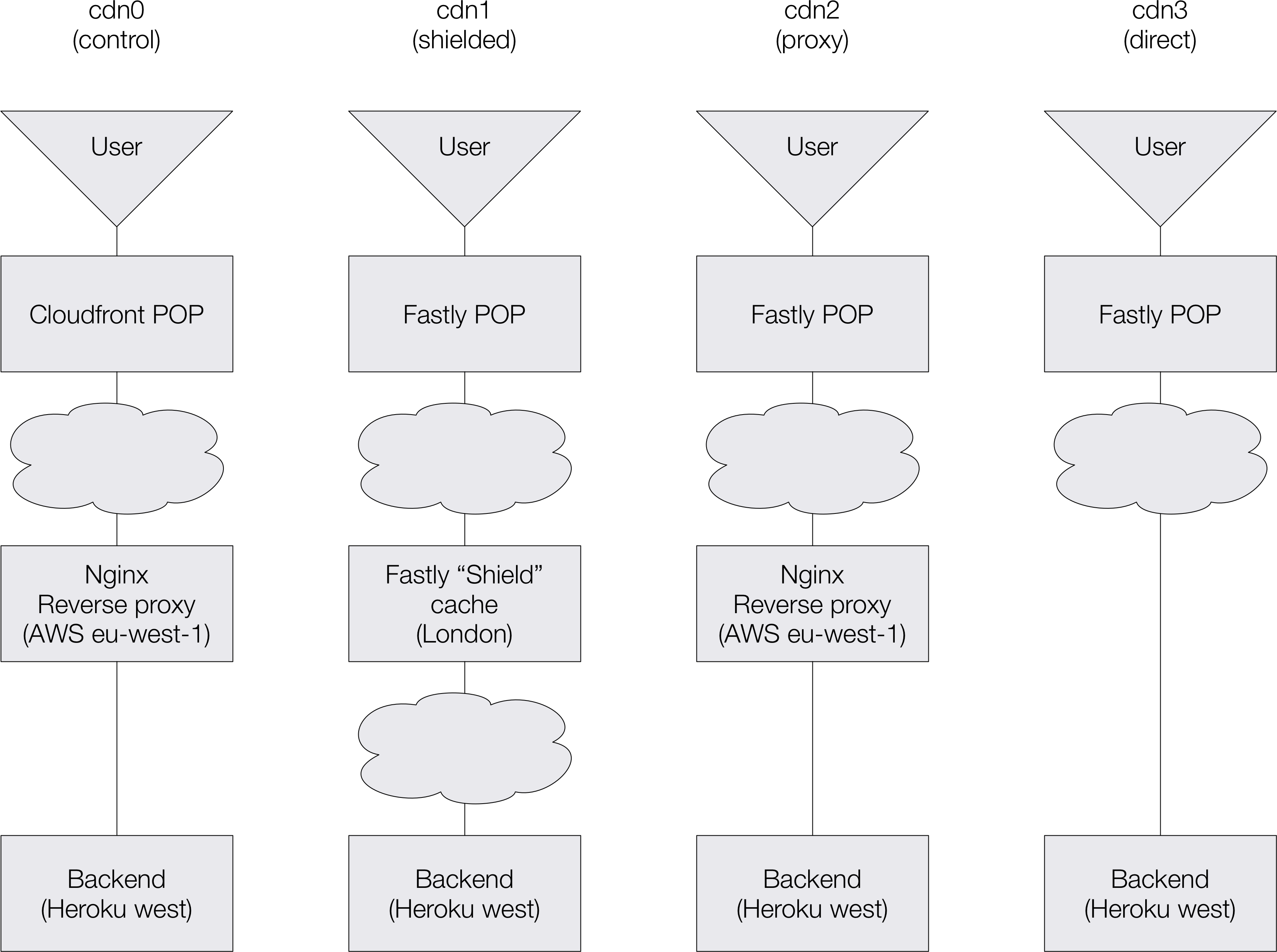
Our current HTTP infrastructure has 3 tiers:
- Client requests hit either a CDN (assets) or our reverse proxy (Nginx).
- The CDN loads from the proxy on misses.
- The proxy is backed by a Heroku-hosted application.
Both the proxy and the Heroku app are hosted by AWS, in the eu-west-1 (Dublin)
datacenter.
Testable infrastructure variants
We’ve set up 4 variants of our infrastructure:
cdn0 is the existing, Cloudfront-based setup - the control.
cdn1 to cdn3 to replaces Cloudfront with various Fastly configurations:
-
cdn1uses Fastly’s “shield” feature, whereby local POPs2 are backed by a second-tier cache (also managed by Fastly). This cache is located in London — as close as possible to our main datacenter. -
cdn2uses our current reverse proxy (which has some in-memory caching) as the CDN’s upstream. This most closely mimics our Cloudfront setup. -
cdn3is backed directly by the Heroku application.
Each of those is given a different DNS entry for each of our TLDs,
cdn[0-3].deliveroo.*, and set up to serve over HTTPS.
Synthetic performance comparison
To get a sense of what performance differences we could observe between countries, we set up a synthetic check per test variant in NR Synthetics.
Each of these checks was configured to request a given asset (our main CSS file) every minute, from a number of different locations across the globe; NR Insights lets us access detailed reports of performance for each individual request.
Because Cloudfront is our existing setup, we allowed for a 1-week warmup period: we wouldn’t want to compare another CDN cache until we were confident that most POPs had had a chance to cache the asset in question.
We then let the system harvest data for a while, and ran analysis queries in NR Insights.
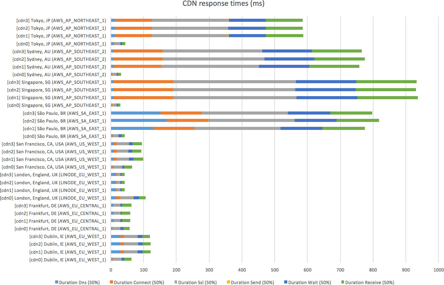
At first glance, this graphs looks like Cloudfront (cdn0) is massively winning
over Fastly (cdn[1-3]). The trick here is that Cloudfront is part of Amazon’s
infrastructure, so it’s unfairly advantaged whenever the pinging server is also
in AWS. This is the case for most of the pinging servers used here, as hinted to
by AWS in their names.
The single case where the pinging server is outside of both Amazon’s and Fastly’s infrastructure (the London server, at Linode) seems to lean in favour of Fastly.
The conclusion here is we can’t learn a lot from synthetic checks — we need to leverage performance data from our users.
Setting up our application for testing
As we use Split to set up A/B tests, tweaking our Rails code to serve the right asset URLs to the right user is relatively simple.
This selects the appropriate test variant for the current user:
# app/application_controller.rb
class ApplicationController
  before_filter { $cdn = ab_test(:cdn_test) }
  # ...
end
And this tells Rails to determine the asset host dynamically:
# config/application.rb
config.action_controller.asset_host = lambda do |path, *args|
  if request = args.first
    '%s.deliveroo.%s' % [
      $cdn,
      tld_from_host(request.host)
    ]
  else
    nil
  end
end
This is adapted of course, and we wouldn’t recommend using a global $cdn
variable in real life!
Now that we’ve instructed our backend to serve different asset URLs for different test variants, we need the ability to report on performance for each variant.
We use NR Browser, which injects a bit of Javascript in each HTML page and reports on performance — somewhat like a dumbed-down Webpagetest, but on every single page view.
The JS library lets us “tag” each pageview with metadata that we can later query against in NR Insights:
<script type="text/javascript">
  if (typeof newrelic !== "undefined") {
    newrelic.setCustomAttribute("cdnServer", "<%= $cdn %>");
  }
</script>
From thereon, it’s just a matter of waiting enough time for enough data to be harvested to reach statistical significance.
Performance for actual users
For this second test, we ran a proper A/B test trying to falsify the hypothesis: in a given country, for a given device type, Cloudfront and Fastly perform the same.
The metric we’ll look at is the duration between the “time to first byte” (the point at which, when loading a page, a browser starts receiving the HTTP response) and the “page loaded” event (when all synchronous assets have been loaded and the page has been rendered).
This is the part of the page load lifecycle where differences in asset load timings may have an impact. Given all other things are unchanged, it’s the only factor of change, which is what we’re after in an A/B test.
Conveniently, New Relic reports on this duration — albeit in two chunks, the DOM processing duration and the page rendering duration.
NR Insights lets us run pseudo-SQL queries that look like the following, and produce an HTML data table (or JSON):
SELECT count(*) * 1.0 AS 'Page views'
  , percentile(domProcessingDuration + pageRenderingDuration, 95) AS 'Time'
  , average(domProcessingDuration + pageRenderingDuration) AS 'Average'
  , stddev(domProcessingDuration + pageRenderingDuration) AS 'Stddev'
  , percentile(domProcessingDuration + pageRenderingDuration, 50) AS 'Time'
FROM PageView
WHERE deviceType = 'Desktop'
FACET countryCode
SINCE '2016-07-01'
LIMIT 20
The HTML output isn’t very convenient, but we needed to post-process the data (to run the T-Test math), so half an hour or copying-and-pasting into Excel follows.
Intermission: for proper A/B testing, have a read of Evan Miller’s Awesome A/B Testing Tools. One of my favourite bookmarks.
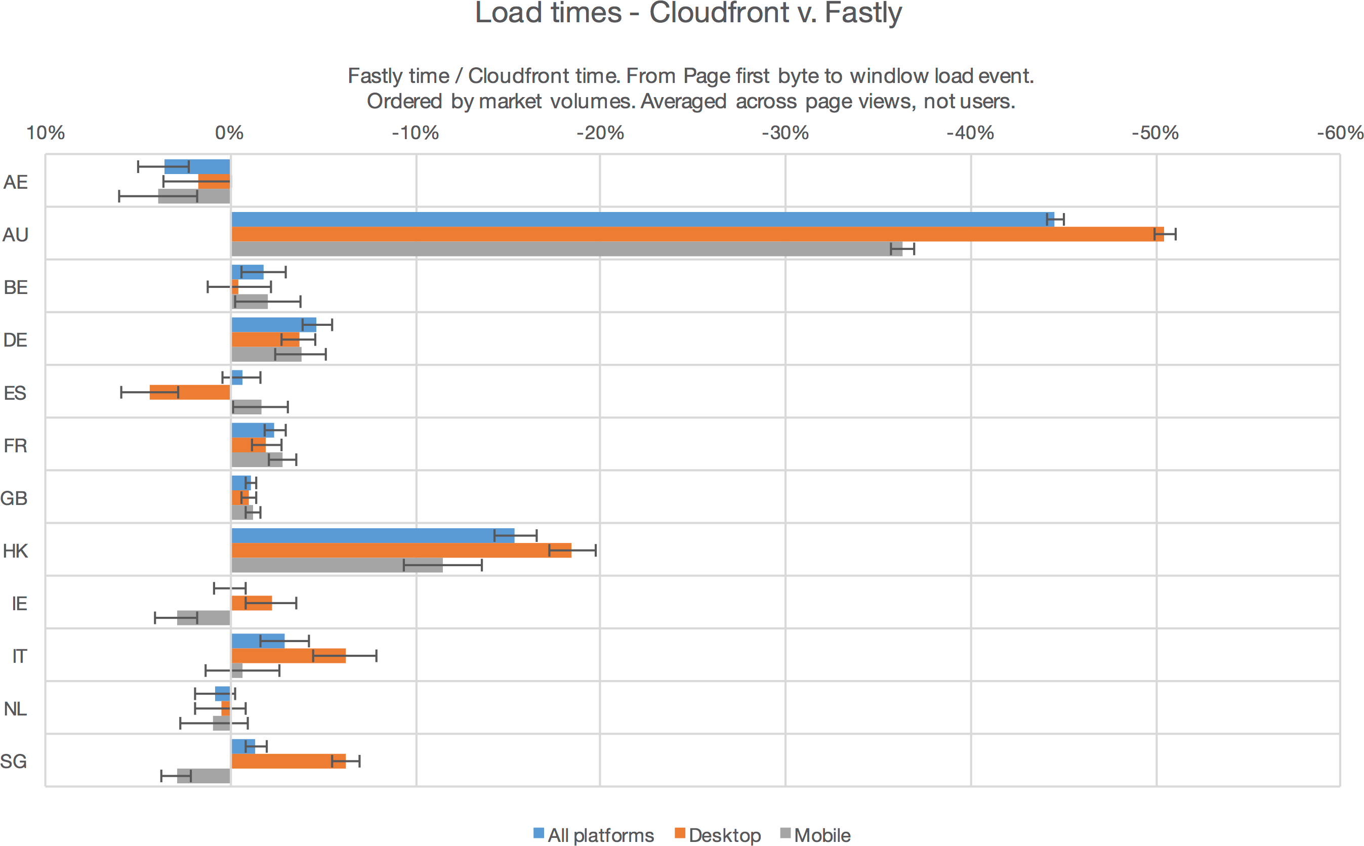
This graphs the ratio of load+render times for Fastly (cdn1 variant, the best
one) versus Cloudfront (cdn0, our pre-existing set up), split by the users’
countries - anything on the right, Fastly wins.
The error bars are for p < 0.05, not good enough for Science or Nature but generally accepted as good enough for multivariate tests in tech companies.
Unlike for our earlier synthetic tests, the results are quite clear cut:
- Fastly is significantly faster almost everywhere.
- Notable exceptions exist:
- the UAE: Fastly doesn’t have a POP there yet;
- Spain on desktops (no obvious explanation);
- Ireland and Singapore on mobiles: Fastly probably has a weaker presence there than Cloudfront — likely as the capitals there are Amazon datacenter cities.
At this point we could opt to just switch over to Fastly and bite the bullet in places where it’s slightly weaker; but what ultimately matters is not how fast our site and apps are, but how many users we satisfy.
Impact on conversion
For this last test, we’ve used the same A/B test setup as above, but this time we measured conversion across CDN variants, countries, and platforms.
We use Segment to relay and store our analytics. It allows us to track events, including custom attributes (metadata), from anywhere in our back end application:
$segment.track 'Session Started', cdn: $cdn
# (...)
$segment.track 'Completed Order', cdn: $cdn
This inserts a record in Redshift, tagged with the user who made the request, the browser, the country, and the CDN variant used (as well as a whole lot of other bits of metadata we won’t use here).
Again, once that had been set up, it was just a matter of waiting until there’s enough data to run a significant χ² test.
Overall, the test results are reassuringly consistent with the changes in
performance: depending on the Fastly setup (cdn[1-3]), we observe either no
conversion change (+0.0% ±0.8%, p = 0.5), or a slight improvement (+0.9%
±0.9%, p = 0.02).
But once split by country and platform, the results are surprising.
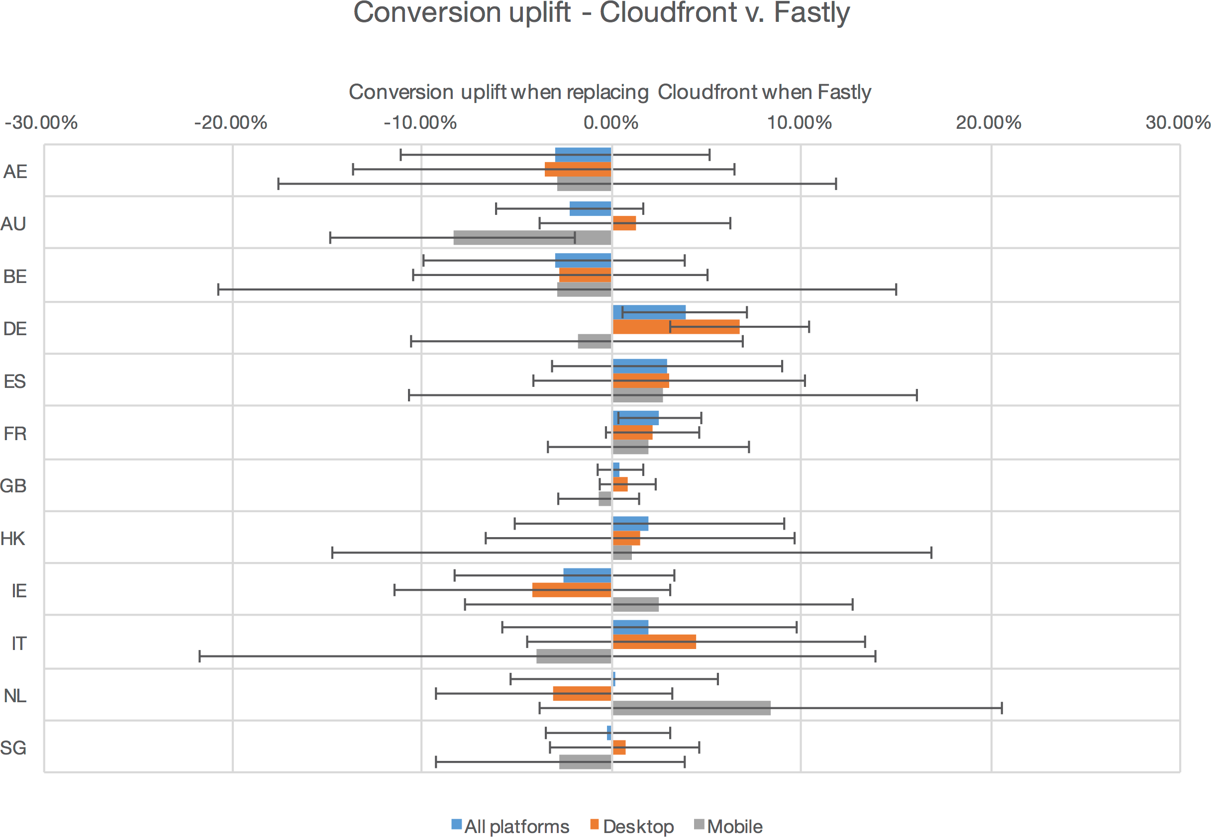
Error bars here are still for p < 0.05, so any result where the error bar crosses zero are subject to caution; we’ll ignore those here. This leaves us with:
-
 Germany and France see a significant improvement in both performance and
conversion.
Germany and France see a significant improvement in both performance and
conversion. -
 Most other countries have conversion and performance trending in the same
direction.
Most other countries have conversion and performance trending in the same
direction. -
 While Australian mobiles see a significant improvement in performance
but conversion is significantly worse!
While Australian mobiles see a significant improvement in performance
but conversion is significantly worse!
We don’t have a solid explanation for this last point. While it’s possible that some Aussie ISPs do something bad to our HTTP requests that cause some to fail, we haven’t been able to reproduce error cases or received error reports form our local teams or local customers.
A more common explanation would be that the volumes of data used for this test aren’t high enough (yet); it’s possible the test hasn’t converged yet. Statistical significance is not a stopping rule when running tests.
Digging into how conversion has evolved over time during the test reveals that, during the course of the test, our Australian market suffered a conversion blip:
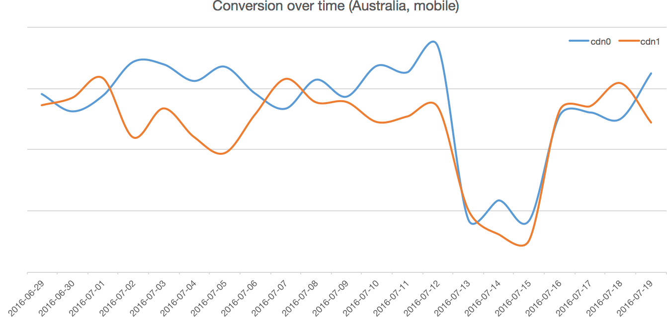
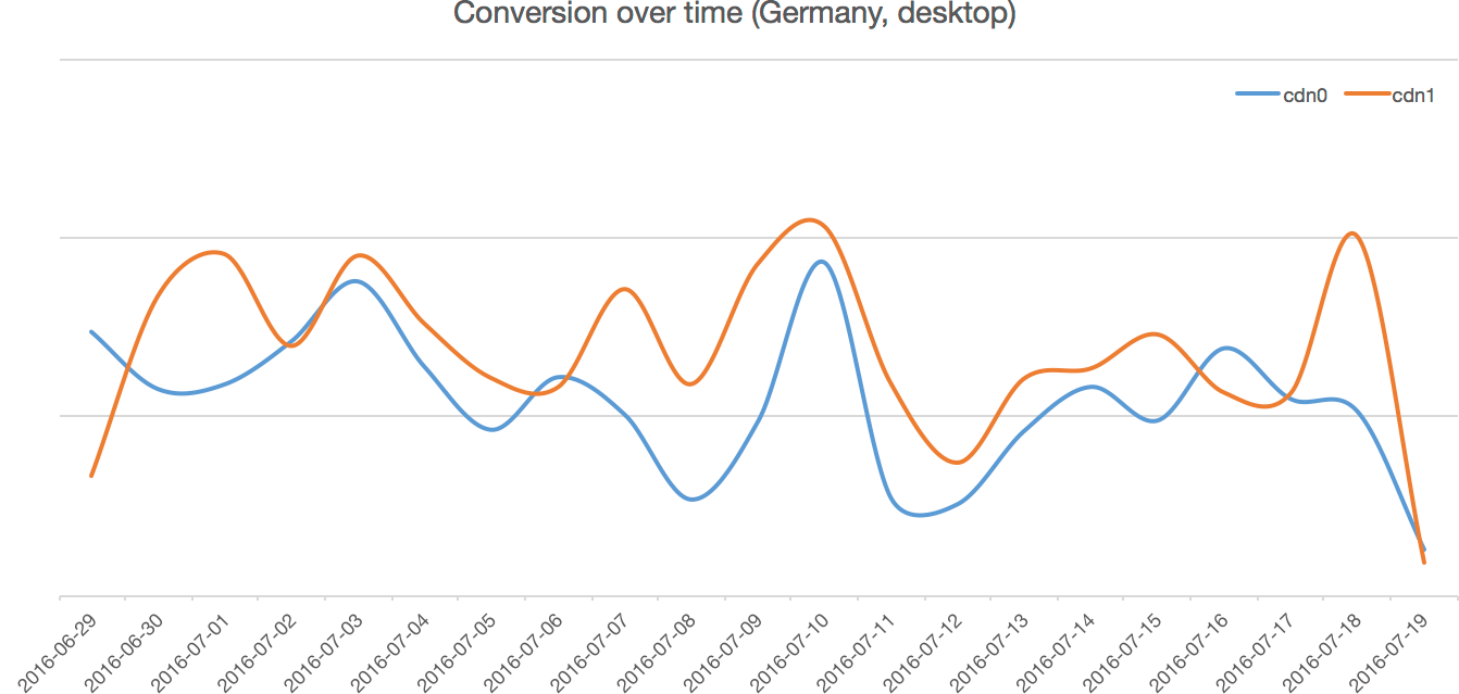
There was an unrelated product issue in Australia — which may well have skewed test results. Conversely, looking at one of the cases where Fastly won over Cloudfront, we saw that conversion was indeed up reasonably consistenly:
Conclusions
This left us scratching our heads somewhat, and a demonstration that AB tests aren’t a panacea: they can give strong results… but they can also give very confusing results if there’s a hidden variable.
Our take on this is to, as we did above, couple A/B testing with other sources that we know correlate to conversion. For user interfaces, this can be focus groups early on and user research down the line; for infrastructure, performance measurements and synthetic matter.
In other words, we’ll trust our A/B test at a global level: across 1 million users, we’re seeing a small, consistent conversion uplift. But we’ll prefer to provisionally trust that performance improvements are a good thing rather that letting the apparent inconsistency in a few locations block us.
Finally, the overall conversion gains can feel pretty underwhelming compared to the performance gains, but remember that this test only affects assets — the TTFB (time-to-first-byte) of our pages is unchanged.
We expect further improvement in our TTFB for key pages (homepage, listing pages) to further improve performance.
Tools used
- Amazon Cloudfront and Fastly: the two CDNs we’ve pitted against eachother.
- New Relic Synthetics: a Pindgom clone that lets us repeatedly call an HTTP endpoint and get statistics on response time.
- New Relic Browser: a small Javascript extension that reports performance data on page loads (think a simplified WebPageTest.org on every page load).
- New Relic Insights: a data warehouse specialized performance analytics.
- Split: a Ruby library to perform A/B testing.
- Segment: an analytics data aggregator, that can harvest data from many sources (in particular our Ruby backend) and push into many sinks (in particular our Redshift warehouse).
- Microsoft Excel. Yeah, yeah. It’s good at spreadsheets and simple graphs though.
Footnotes
-
“Point of Presence”. This refers to the many caching servers a CDN places as close as possible to users, typically within ISPs’ datacenters. POP placement significantly influences performance. ↩
About Julien Letessier

I’m a software geek: I build things with code, like web applications, platform tools, search engines, or even tiny crypto utilities. I’ve previously had fun as an engineer, scientist, architect, manager, and start-up founder.
These days I mostly help other people building software here at Deliveroo!